

How to Design a Custom Flag: From Concept to Finished Product
Having an idea for a custom flag is the easy part. Turning that idea into something that still looks striking when the fabric moves, folds, and catches the wind? That's where most designs run into trouble.
A logo or message that works on a screen can fall apart entirely on a flag. So we put this blog together to walk you through the whole process: concept, layout, color, symbols, text, and final review. By the end, you'll know how to design a custom flag that holds up in the real world, not just on a flat monitor.
Step 1: Clarify the Purpose of Your Custom Flag
Before anything else, decide what the flag needs to say. Not in a sentence, but in one core idea. A school flag may need to communicate pride and recognition. A business flag may need brand visibility at a glance.
An event flag needs to be readable for someone walking past at a distance. A ceremonial flag asks for dignity and nothing fussy, competing with it.
When you think about how to make a custom flag that actually holds up, the process starts with clarity, not software. Even the best custom flag maker can’t fix a muddled message.
One strong message produces a far better flag than three competing goals sharing the same space. Settle on that single idea before you open any design tools.
Step 2: Design Your Own Flag for Motion
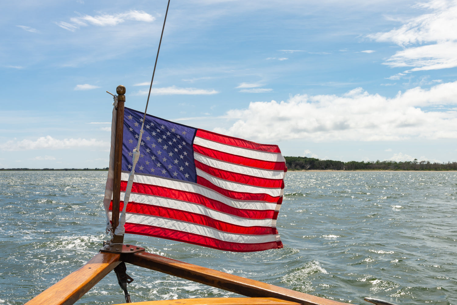
Flags are never static. The fabric moves, folds, and the wind hides or reveals parts of your design without warning. That changes how you approach everything.
- Fabric will cause parts of your design to disappear and reappear
- Small details get swallowed by folds
- Your flag must still read clearly when it isn't fully extended
If your design only works when it’s laid perfectly flat on a table, it’s leaning too hard on fine detail. Think about what survives movement. That's the version worth building.
Step 3: Build a Strong Flag Layout Before Adding Details
Every strong custom flag starts with structure. Decoration comes later. Begin by deciding what kind of flag you're making:
- Symbol-led: A strong icon or emblem does most of the talking.
- Logo-led: Your brand mark takes center stage.
- Text-led: A short name or phrase is the primary element.
That one decision shapes everything that follows.
- Place your focal point early and let other elements support it.
- Avoid crowding the center with too many competing elements.
- Use empty space to let the design breathe.
Flags cluttered with details lose their impact quickly. When you give your main idea room to stand on its own, the whole design feels calmer, stronger, and easier to read in motion.
Step 4: Choose Colors That Stand Out at a Distance
Color does much of the work on a flag, especially when someone sees it from across a parking lot or down a street. What looks rich on a backlit screen can behave very differently on fabric out in the sun.
A few things worth keeping in mind:
- High contrast works better than subtle tonal shifts.
- Too many colors weaken recognition.
- Bold color blocks are easier to read in motion.
- A clear separation between the background and the foreground is key to visibility.
If you can, request a physical proof or sample before you finalize anything. Ink, fabric, and daylight can change how colors feel. A quick check now can save you from a washed-out or hard-to-read flag later.
If you’re unsure about color choices, we’re happy to help you work through them.
Step 5: Decide What Deserves the Most Space on Your Flag

On a flag, everything competes for attention. Your job is to pick a winner.
Ask yourself:
- What is the most important symbol, word, or shape?
- Can it take clear visual priority over everything else?
Then design around that:
- Give the key element more space and a stronger contrast.
- Let secondary details support it, not compete with it.
- Favor large, simple shapes over lots of small ones.
- Make sure every element earns its place.
Weak flag designs treat everything as equally important. The result is that nothing stands out. When you decide what matters most and give it room, the flag becomes easier to understand at a glance, exactly what you want outdoors.
Step 6: Use Text to Support Your Custom Flag Design
Long text is hard to read from a distance. That’s just the reality of flags and outdoor viewing.
Keep a few basics in mind:
- Short names or brief phrases work best.
- Small text gets lost in motion.
- Decorative fonts can hurt readability.
- Symbols and bold shapes communicate faster than sentences.
If you’re tempted to run a full line of copy across your flag, pause and ask if one symbol or a simplified wordmark could do the same job with less effort for the viewer.
Adding more words rarely makes a flag clearer. Often, they make reading harder.
Step 7: Simplify Logos and Artwork for Real-World Use
Your logo or illustration might look great on a business card, website, or brochure. A flag asks for something slightly different. Thin lines, fine gradients, and tiny icons can disappear as the fabric moves and the viewing distance increases.
For flag use, consider:
- Simplifying detailed logos into cleaner, bolder shapes.
- Thickening lines so they hold up at a distance.
- Removing tiny icons or secondary marks that won’t survive motion.
Simplifying your artwork for a flag doesn’t weaken your brand. It helps your brand hold up in real conditions, such as wind, distance, and changing light. Think of it as adapting the design for a new medium, not compromising it.
Step 8: Run the Glance Test on Your Custom Flag Design
Before you commit to a final design, step back and run a simple “glance test.” The best flags are easy to remember and easy to describe.
Ask:
- Does the main idea still read when you shrink the design down on screen?
- What's the first thing your eye goes to when you step back?
- Can someone describe the flag in one sentence?
- Are there details that only work up close and disappear at a distance?
If the answers reveal weak spots, this is the moment to fix them. Often, the strongest flags are the simplest: clear, bold, and instantly recognizable.


Step 9: Review Your Flag Like a Viewer, Not the Designer
By the time you reach a final version of your custom flag, you’ve lived with the design for a while. That makes it harder to see it the way a stranger would.
Before you sign off, check:
- Is the focal point still obvious to someone seeing this for the first time?
- Is the text still readable at arm's length and then from further back?
- Do the colors separate clearly, or do any of them blend in ways that hurt visibility?
- Does the design feel balanced instead of crowded?
- Will the main idea survive motion and distance outdoors?
Trimming extra details at this stage almost always strengthens the finished flag. If something isn’t adding to the message, it’s quietly taking away from it.
From Idea to Design That Actually Works

A strong custom flag starts with a clear message and then moves through motion, layout, color, hierarchy, text, simplification, and one honest final review. Each step adds stability. Skip one, and it usually shows once the flag is flying.
Follow them through, and you end up with a flag that reads clearly, holds up outdoors, and does exactly what you meant it to do.
If you’re ready to turn a sketch, logo, or rough idea into a finished flag, we’re here to help. Our flag design service covers everything from logo cleanup and simplification to full layout decisions and color choices tailored for fabric.
Request a Custom Flag Quote from Kengla Flag Co., and we’ll walk you through each step until your design is ready to fly.
FAQs
What makes a strong custom flag design?
Strong flags have one clear message, bold readability, and a simple structure. The main idea should be visible from a distance and still readable as the fabric moves.
Can I design my own flag if I only have a rough idea?
Yes. A symbol, a logo, or even a quick sketch is enough to start. We can help you develop the concept into a finished design from there.
How much text should go on a custom flag?
As little as possible. Symbols and bold shapes communicate faster and more clearly than words, especially at a distance or in motion.
When should I use a flag design service?
When you need help with logo cleanup, layout decisions, color choices, or readability. A flag design service takes your idea and shapes it into something that works on fabric, not just on a screen.
